Color Accessibility: The Basics to Creating a Brand Experience For All

When I'm developing a brand identity, color is one of the most important elements I consider. I look at color psychology to choose colors that invoke the right feeling and convey the right story. I build color palettes that can be used both digitally and in print and I make sure there are plenty of options for combining your brand colors in different ways. But the most important factor I consider is accessibility.
345 million people in the world are color blind. Approximately 246 million people in the world have low vision. That's a lot of potential customers that aren't having good experiences with your brand if color accessibility isn't considered. Not to mention it's annoying to any user, visually impaired or otherwise, that comes across content that's hard to decipher because the colors are bleeding together.
When you start with accessibility in mind and you'll create a brand identity and experience that is inclusive and future proof. Keep reading to learn the basics of color accessibility, how to implement it across your brand, and tools to help you along the way.
If you'd like to learn more about what accessible design is and why it's so important before we dive into color accessibility, read our article Accessible Design is Better Design for Everyone.
Now let's get to the basics of color accessibility...
check the contrast
Contrast is key when it comes to color accessibility. If you don't have enough contrast between colors, especially where text is concerned, your content will be hard to read.
The minimum requirement to meet W3C (the World Wide Web Consortium) AA standards is 4.5:1. When designing your brand color palette make sure to check the contrast ratio of each color combination.

If that reads like gibberish to you don't worry, there are free online tools that help you check color contrast like Colorable and Color Safe. When using color with text, note that the ideal contrast ratio may vary depending on the text size. Use the Accessible Color Generator from learnui.design to check color contrast for both large and small text, it will suggest alternatives if you don't meet the requirements.
Pro Tip: You'll need the hex codes for your color palette to use the contrast calculators. If you don't have the hex codes you can use this color converter.
combinations to avoid
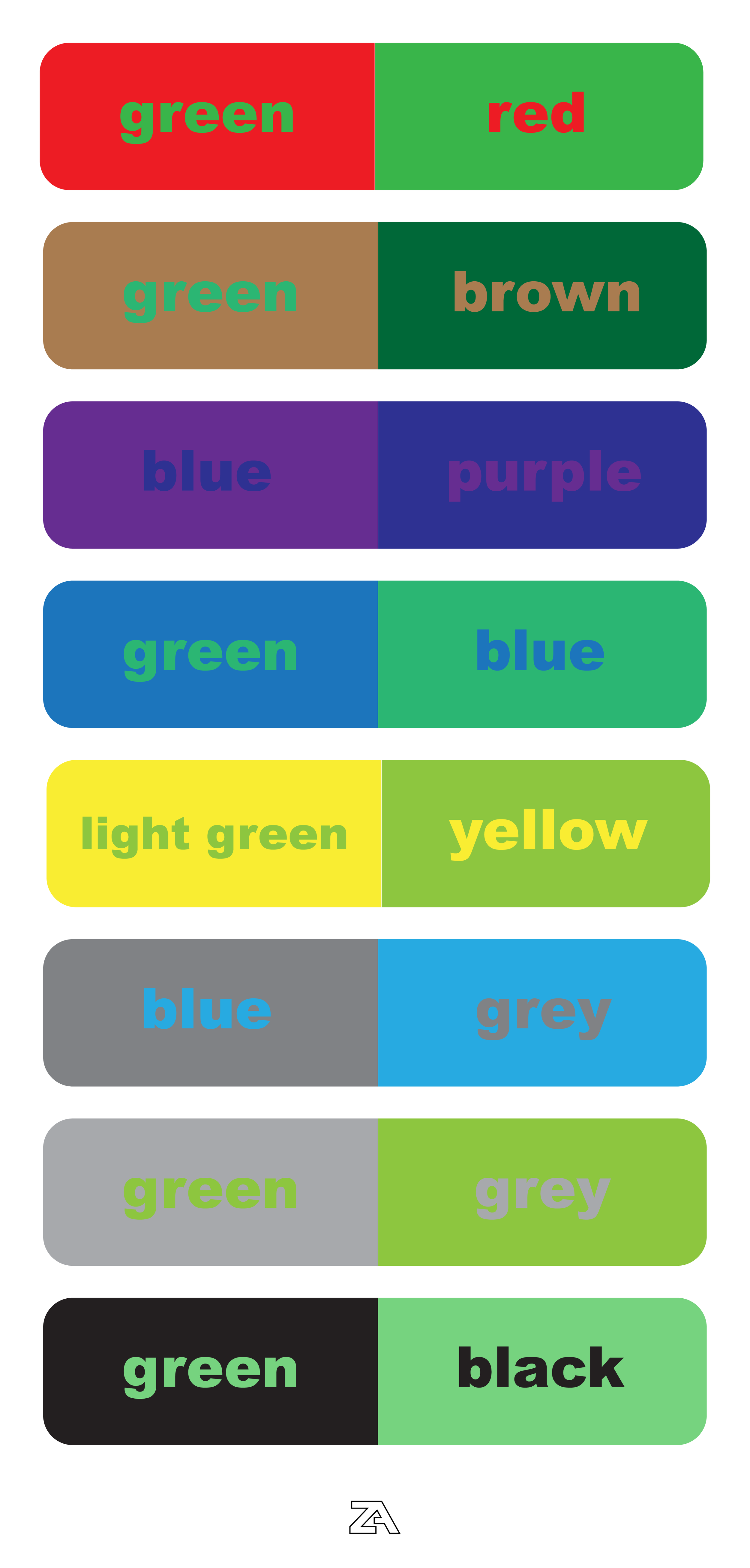
Color blindness comes in different types and severities. In general, it limits a person’s ability to differentiate red, green or blue light. Here are some color combinations to avoid to keep your brand accessible...
Green + Red
Green + Brown
Blue + Purple
Green + Blue
Light Green + Yellow
Blue + Grey
Green + Grey
Green + Black
This isn't to say that you can't have both a green and blue hue in your color palette. It means that you will need to be careful when implementing your color palette across your brand experience, like using a blue background with green text.
use colors and symbols or textures
When calling out important information or conveying an important message on your website, for example, make sure you aren't solely relying on color. Adding symbols in addition to color will ensure that users understand what you're trying to tell them.

You can also include the option to add textures or patterns over colors in things like charts and graphs to make them easily discernible. Trello introduced this feature on their platform back in 2014 and it works incredibly well for their card labels.

communicate accessibility specifications
If you have a Brand Book or at least a Brand Style Guide, make sure to include specifics on how to use your color palette to meet accessibility standards. This ensures that your team and anyone else working with your brand is on the same page and implements the brand color palette in the way you intended it to be used.
Make sure to include what color combinations are A-OK and which ones are not. Adding in the contrast ratio can also be a helpful reference.

let's get accessible
Take what you've learned from this article and choose one action you can take to get the ball rolling. It could mean doing more research on color accessibility or inputting all of your color codes into one of the contrast calculators so you know where your current brand stands. If you're currently building a brand, start with accessibility! You'll be set up for success from the beginning.
in conclusion
It's easy to view these strategies as limiting, however, I will counter with a quote from Paul Hollywood from The Great British Baking Show, "don't go for style over substance". The most important factor in your brand experience is the value you're providing. That value should be accessible to everyone.